Alex Constantine - February 16, 2011
By Jim Edwards
BNet | February 15, 2011
Steven Heller is a design historian and the co-founder of the MFA in design criticism at the School of Visual Arts in New York. He is also the author of “The Swastika, a Symbol Beyond Redemption?” and “Iron Fists: Branding the 20th Century Totalitarian State,” both books about the history of fascist symbolism. Heller recently discovered the German Nazi Party’s branding and design handbook at an antiquarian book fair.
Existing within a larger manual on the organization of the Nazi Party, Adolf Hitler’s style guide consists of
… 70 full-page, full-color plates (on heavy paper) that provide examples of virtually every Nazi flag, insignia, patterns for official Nazi Party office signs, special armbands for the Reichsparteitag (Reichs Party Day), and Honor Badges. The book ‘over-explains the obvious’ and leaves no Nazi Party organization question, regardless of how minute, unanswered.
All that according to a recent post on Heller’s blog.
He agreed to talk to The Tagline about the similarities and differences between history’s most notorious propagandists and modern American marketers.
BNET: What exactly is this book you’ve found?
Steven Heller: I was looking for a holy grail, so to speak, [when I’m researching my history books] I always look for some kind of guidebook, handbook, standards manual as it’s called in corporate identity terms. And what I found was a handbook for the organization of the Nazi Party and within this handbook it sets out what amount to graphic standards, a graphic sampler, typographically, symbolically and even in terms of clothes and fashion that comprised the Nazi experience.

BNET: How did you find it?
SH: I had heard rumors that something like this existed. I wanted to find something that was the equivalent of a Westinghouse or a GE or an IBM typographic manual, a corporate identity manual. So I just kept asking people. One day I was at a book fair, one of the big New York City antiquarian fairs, and there was a dealer who was, paradoxically a dealer of Judaica. He has a lot of avant garde materials from the left, Jewish material and Judaic materials, and he had as a side venture a large collection of fascist literature. He told me he had this book. The minute I saw the book I knew it was what I was looking for.
BNET: How much did you pay for it?
SH: It was $1,200, $1,300.
BNET: How many of these books exist?
SH: Probably quite a few. There were a number of editions. I had an edition without in fact knowing. It was in my collection. [Heller explained that he had given it away to a museum without realizing what it was.]
BNET: There is something obscene about looking at Nazi material for its aesthetic sense. Talk about the ethics of that.
SH: For a long time I would never buy this material because I had the sense that it was obscene. For a long time I would never drive in a Volkswagen because I’m a Jewish kid from New York. And there is a certain, people have a fetish for this material for reasons I know not. When I was a kid I went to a military school so the idea of regalia was very enticing. At the same time it’s also horrific because you know what those uniforms stood for.
 In fact, Hugo Boss was the designer back in the 1930s of the SS uniforms. It’s not the same Hugo Boss that exists today, it’s a totally different company. But people made these garments. They made the jewelry. They made the flags. This is all part of everyday life. These materials were so integrated into everyday life yet they had this charged symbolism.
Once the crimes of the Nazis were exposed they also became representative weapons of those crimes. If one is involved in understanding the power of design the power of symbols the power of typography to alter behavior, to influence behavior which it does everyday on a corporate level, on a nonprofit level, on a benign level, on a malicious level, you have to understand what went on with the Nazi practices. I can’t deny there’s a certain allure of the material rooted in its history. And also in the quality, as a designer I see the quality and consistency of their brand. But also I look at it as teaching us something.
BNET: Is this beautiful in any way?
SH: Some of it is … You can look at something and unpack it and deconstruct it and analyze it and you can divorce it from that particular context, if only for a moment, and see how well it was created. If you look at Albert Speer’s outdoor spectacles that rallied so many people to the Nazi Party you have to admire the ability to do that while at that same time be horrified by the fact that it moved so many people to an immoral level. And ultimately they paid for it.
BNET: Do modern governments have branding and image guidelines like this?
SH: Yes, now they do because designers have become more involved in the identity of state, and certain states have laws like the Nazis did. The Nazis had a law called “the protection of national symbols decree” and it meant the swastika could not be used commercially. In order to use the swastika you had to have the sanctity of the party or government. It was put in place in part to prevent Jews from using it because Jews were forbidden to use or hang a Nazi flag or swastika. And of course were relegated to their own symbolic ghetto with the yellow star. We actually allow people to burn flags in this country [although there was a movement to ban that]. We’re not allowed to deface our currency, although people do. These are all protections for our sanctified symbols, which are nothing more than pieces of cloth.
BNET: Why do you think the Nazis cared so much about the way they looked?
SH: It wasn’t the Nazis per se that cared. It was Adolf Hitler who joined the party and became their ersatz art director by becoming head of a propaganda or publicity division. He had this instinct for uniformity. The Germans were uniform anyway going back to Bismarck. He often said he was influenced by the Soviets. The Soviets had their hammer and sickle which was really a very modern flag, and an anti-coat of arms compared to the monarchies that used the double-headed eagles and all that stuff.
I always joke that if you went to Catholic school you didn’t have to worry anymore because you woke up in the morning and wore the same uniform everyday. It took away choice but it also took away a liberal sensibility. It eliminated the need to worry about things like fashion or rebellion. There were enough variables in the Nazi identity. You could earn badges and get insignia.

BNET: How similar are the design guidelines to something we’d see in modern day corporate design handbook?
SH: These are not really guidelines per se. There were a variety of departments that handled this stuff and some were stricter than others. Some of the designers were more talented than others. And there were variations of things. There was the overall national symbol but then there were different divisions. There were posters done by individuals rather than committees so those posters took on the identity of the artist. If you’re a corporation, one company, you have one purpose in mind and you don’t have lots of different satellites around you. It’s easy to have a corporate identity.
BNET: Is there anything that a modern designer could learn from reading it?
SH: I don’t think so. It gets very, very detailed and a modern designer is more ADD than that. There’s a lot that can be learned from the organization of the Nazi Party. When some of the grassroots groups started working through the Internet they set up little committees that answer to other commitees so there was a network, you didn’t necessarily need a central committee to do the work. What the Nazi Party managed to was make organizational charts into something that was their lifeline. Everybody was called a “fuhrer,” a leader.
BNET: In many companies with different brands they often have very different branding for each product, but the Nazi branding is very similar no matter where it appears — it’s all black and red and lots of sharp angles. Is that kind of design unity advisable? A lot of U.S. corporations seem to get along fine without it.
SH: Well a lot of corporations don’t want it. If you’re Philip Morris you don’t want to be associated with cigarettes if you’re making meatloaf. IBM has always maintained a very strict IBM look from the IBM color blue to the slogan “think.” Apple is very consistent as well. I think it depends on what you’re selling. If you’re selling one thing but a lot of different versions of it you want to maintain that unity. If you’re selling diverse products you want each product to have the identity that product deserves.

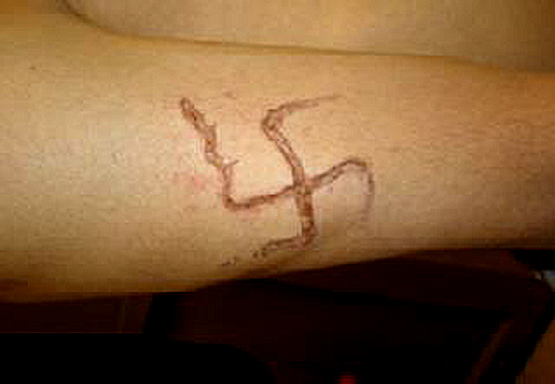
BNET: Can the swastika ever be redeemed [the symbol originated in Eastern religions centuries before Hitler]?
SH: Well, it’s a debate. I don’t know. If you saw a swastika outside your house right now, how would you feel?
BNET: It would feel pretty weird. Unless it was reversed and it was inside some sort of Buddhist yoga thing, but even then it would be weird.
SH: There are lots of people who are like that, who never had that relationship with the swastika. It probably will be redeemed over the course of a few generations. When I gave a lecture years ago to a student group, one of the students, an African-American, happened to be also a Buddhist, and the next week he brought in a big swastika and posted it on his work area. It was a slightly hostile act, but I understood what he was doing. He was making a statement. It wasn’t a black swastika in a white circle, it was green swastika. I accepted it.
Related